


Monday, November 19, 2012
Sunday, November 18, 2012
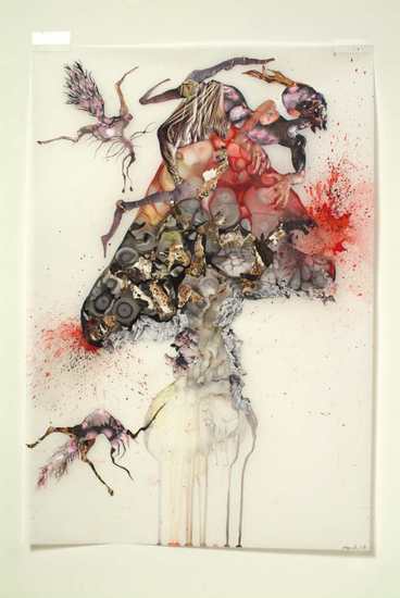
Work from Painting with Water Media Class
.JPG)

.JPG)
Christine Kibre: mixed media collage | watercolor | photo transfer
.JPG)

.JPG)
Chloe Meyer: ink, watercolor, gouache

.JPG)
Juan: acrylic pour | mixed media
.JPG)
.JPG)
.JPG)
Sharon Esker: three mixed-media collages
.JPG)
David Baxter: Tantric watercolor
Saturday, October 27, 2012
FINAL ASSIGNMENT #5 WATERMEDIA CLASS
For your final assignment, I would like you to start collecting interesting images, forms and colors from magazines. Through the next few weeks you will create a series of collages on 8 x 10 paper. The paper can be sketchbook pages, drawing, or copy paper. Through this investigation, you will decide on a final project using any media. You can use collage in your final assignment along with watercolor, gouache, ink, acrylic, or any other media that you want to enhance your project. You can do a series of work, or just a single piece. Consider materials, proportion of page, content, color, subject matter, composition, and size. Most of the class will be devoted to working on your project. We will stop working at 8:45 to appreciate eachothers work. Bring all the work that you made in class!
See you then.
Feel free to email with questions: francesca@pastineart.com

This artwork, Bird with displaced color by Rosemarie Trockel ink and watercolor
See you then.
Feel free to email with questions: francesca@pastineart.com

This artwork, Bird with displaced color by Rosemarie Trockel ink and watercolor
Water Media Assignment #4
Leonie Guyer will guide the class through a series of exercises on "seeing" using gouache to paint geometrical shapes that reveal compositional strategies and subtle color shifts. . Bring all your brushes, watercolors, and paper. Leonie will supply gouache, but if you have some, please bring your own.


Untitled, FR-33, 2010, colored pencil and graphite pencil on old French paper (18th-19th century), 10 3/4 x 10 in.
Water Media Assignment #3
Mel Prest will demonstrate photo ink-jet-image transfers and acrylic pour techniques. Bring an ink-jet print that is abstract or semi abstract, watercolor block and watercolor pad.


The work of Val Britton
Val Britton is a Bay Area artist whose work is concerned with mapping distances. She uses inks, gouache and collage to create the constellations of land masses and highway routes against what looks like distant galaxies.


Wednesday, October 24, 2012
Assignment #2 Water Media Class
Assignment #2
.jpg)
CREATING AN ENVIRONMENT
With washes, inks, plastic wrap, blowing techniques, gouache and pen, we can create imaginary environments.
Watercolor
waterclor block
Watercolor pad
Gouache
Ink
Pens
Salt
Plastic Wrap
Water Spritzer
cooked spaghetti
True Blue Stands Out... article in NYT

Science
True Blue Stands Out in an Earthy Crowd

Robert F. Bukaty/Associated Press
By NATALIE ANGIER
Published: October 22, 2012
NATURAL COLOR: Wild blueberries ready for harvesting in Warren, Me.
Multimedia
Related
-
Blue Through the Centuries: Sacred and Sought After (October 23, 2012)
Scientists, too, have lately been bullish on blue, captivated by its
optical purity, complexity and metaphorical fluency. They’re exploring
the physics and chemistry of blueness in nature, the evolution of blue
ornaments and blue come-ons, and the sheer brazenness of being blue when
most earthly life forms opt for earthy raiments of beige, ruddy or
taupe.
One research team recently reported the structural analysis of a small, dazzlingly blue fruit from the African Pollia condensata plant that may well be the brightest terrestrial object in nature. Another group working in the central Congo basin announced the discovery of a new species of monkey,
a rare event in mammalogy. Rarer still is the noteworthiest trait of
the monkey, called the lesula: a patch of brilliant blue skin on the
male’s buttocks and scrotal area that stands out from the surrounding
fur like neon underpants.
Still other researchers are tracing the history of blue pigments in
human culture, and the role those pigments have played in shaping our
notions of virtue, authority, divinity and social class. “Blue pigments
played an outstanding role in human development,” said Heinz Berke, an
emeritus professor of chemistry at the University of Zurich. For some
cultures, he said, they were as valuable as gold.
As a raft of surveys has shown, blue love is a global affair. Ask people
their favorite color, and in most parts of the world roughly half will
say blue, a figure three to four times the support accorded common
second-place finishers like purple or green. Just one in six Americans
is blue-eyed, but nearly one in two consider blue the prettiest eye
color, which could be why some 50 percent of tinted contact lenses sold are the kind that make your brown eyes blue.
Sick children like their caretakers in blue: A recent study at the
Cleveland Clinic found that young patients preferred nurses wearing blue
uniforms to those in white or yellow. And am I the only person in the
United States who doesn’t own a single pair of those permanently popular
pants formerly known as dungarees?
“For Americans, bluejeans have a special connotation because of their
association with the Old West and rugged individualism,” said Steven
Bleicher, author of “Contemporary Color: Theory and Use.” The jeans take
their John Wayne reputation seriously. “Because the indigo dye fades
during washing, everyone’s blue becomes uniquely different,” said Dr.
Bleicher, a professor of visual arts at Coastal Carolina University.
“They’re your bluejeans.”
According to psychologists
who explore the complex interplay of color, mood and behavior, blue’s
basic emotional valence is calmness and open-endedness, in contrast to
the aggressive specificity associated with red. Blue is sea and sky, a
pocket-size vacation.
In a study that appeared in the journal Perceptual & Motor Skills,
researchers at Aichi University in Japan found that subjects who
performed a lengthy video game exercise while sitting next to a blue
partition reported feeling less fatigued and claustrophobic, and
displayed a more regular heart beat pattern, than did people who sat by red or yellow partitions.
In the journal Science, researchers at the University of British
Columbia described their study of how computer screen color affected
participants’ ability to solve either creative problems — for example,
determining the word that best unifies the terms “shelf,” “read” and
“end” (answer: book) — or detail-oriented tasks like copy editing. The
researchers found that blue screens were superior to red or white
backgrounds at enhancing creativity, while red screens worked best for
accuracy tasks. Interestingly, when participants were asked to predict
which screen color would improve performance on the two categories of
problems, big majorities deemed blue the ideal desktop setting for both.
But skies have their limits, and blue can also imply coldness, sorrow
and death. On learning of a good friend’s suicide in 1901, Pablo Picasso
fell into a severe depression, and he began painting images of beggars, drunks, the poor and the halt, all famously rendered in a palette of blue.
The provenance of using “the blues” to mean sadness isn’t clear, but L. Elizabeth Crawford, a professor of psychology
at the University of Richmond in Virginia, suggested that the
association arose from the look of the body when it’s in a low energy,
low oxygen state. “The lips turn blue, there’s a blue pallor
to the complexion,” she said. “It’s the opposite of the warm flushing
of the skin that we associate with love, kindness and affection.”
Blue is also known to suppress the appetite, possibly as an adaptation
against eating rotten meat, which can have a bluish tinge. “If you’re on
a diet, my advice is, take the white bulb out of the refrigerator and
put in a blue one instead,” Dr. Bleicher said. “A blue glow makes food
look very unappetizing.”
Not so to those that would dine upon us. Field studies of color-coded
insect traps have shown that mosquitoes are particularly attracted to
blue.
That blue can connote coolness and tranquillity is one of nature’s
little inside jokes. Blue light is on the high-energy end of the visible
spectrum, and the comparative shortness of its wavelengths explains why
the blue portion of the white light from the sun is easily scattered by
the nitrogen and oxygen molecules in our atmosphere, and thus why the
sky looks blue.
Down on earth, organisms assume many of their colors with pigments,
chemical substances that selectively absorb some wavelengths of light
and reflect others — the ones we then see as the object’s color. Plants
look green because the chlorophyll pigment in their leaves absorbs
pretty much all sunlight except green. Cardinals owe their flaming
feathers to carotenoids, orange-reflecting pigments the birds extract from ingested berries and insects.
When it comes to blueness, though, the chemical approach is not always
an option. Fungi, crabs and beetles may do cerulean, said the Yale
ornithologist Richard O. Prum, “but for some reason, vertebrate
physiology never evolved the ability to make or use blue pigments.”
In place of blue pigment, vertebrates and others turn to figment. As Dr.
Prum and others have determined lately, many of nature’s most
spectacular blues — the plumage of a blue jay or indigo bunting, the
teal of a skink lizard’s tail, and now the lesula monkey’s blue scrotum
and Pollia’s shimmering blue fruit — are structural in nature. They
arise from the specific shape and arrangement of their underlying
components.
“When you have a color obtained with pigment, it’s a characteristic of
the material itself,” said Silvia Vignolini, a physicist at the
University of Cambridge and the lead author of the new report about the
Pollia condensata. “When you make color with structure, you start with a
material that is transparent, but by changing the structure by just a
few hundred nanometers” — billionths of a meter — “you can change the
color.”
Dr. Vignolini cited the analogy of soap bubbles, which begin as clear
liquid and then assume different hues depending on their size, the
thickness of their membranes and the angle at which they’re viewed.
Structural blues are essentially built of soap membranes trapped at just
the right orientation and thickness to forever glint blue.
Stacking style counts, too. Sometimes the color-forming components are
arrayed in a so-called quasi-ordered formation, a mix of regularity and
randomness, like spaghetti packed in a box. That pattern yields the
steady matte blues of the jay’s feathers and the monkey’s pelvis. In
other cases, the constituent bubbles are more strongly periodic in their
arrangement, like atoms in a crystal, and the resulting blues possess
the glittering, iridescent sheen seen in the wings of a blue morpho
butterfly or, brighter still, the Pollia fruit. Dr. Vignolini and her
colleagues determined that the lentil-size fruit reflected back 30
percent of the light cast upon it, the highest reflectivity for any
land-based biological product known.
The bold blue covering turns out to be a bit of a cheap trick, designed
to attract birds and other potential seed dispersers without bothering
to invest in the expensive quid pro quo of a pulp. “The fruit has no
nutritional value,” Dr. Vignolini said. “It doesn’t harm birds, but it
doesn’t benefit them, either.”
The ruse doesn’t fade with time. “We have some samples in our collection
that are almost 100 years old,” Dr. Vignolini said, “and they look the
same as the fruit growing today,”
In life as in art, blue will always stay blue.
Wednesday, October 17, 2012


material list for painting with water media class
1. #12 or #10, #8, #6 round watercolor brushes, 1” Flat
Brush (the flat should be synthetic, the rounds can be natural or synthetic; watercolor brushes have
short handles);
2. Heavy weight Foamcore or Gator board larger than your paper(just tape the edges all the way around
with duct tape. Works great and very cool!)
3. Watercolor pad (sketchbook) to work out ideas
4. Several sharp #2B pencils
5. Kneaded eraser or latex eraser
6. Water container: a plastic margarine tub or other plastic jar
7. Paper towels and box of tissues
8. Watercolor palette: approximately 11 x 15”. Don’t get anything fancy or too small.
9. Watercolor paper: 1 sheets 140-lb. Arches Watercolor paper (cold-pressed). Cut your sheet in
quarters for the first class. Colors:
10. WaterColors to Start with:
Ultramarine Blue, Cadmium Red or Napthol Red, Cadmium, Yellow, Burnt Sienn, Burnt Umber, Yellow Ochre, Lemon Yellow, Permanent Rose
11. Other handy tools for later (optional):
Art masking fluid, Candle wax (uncolored candle), natural sponges, scraping tool, old toothbrush
colored wax sticks, pastels, Gladwrap, color pencils/crayons, cheap bristle brush, anything you have to
create texture
OTHER MATERIAL WILL BE INTRODUCED IN CLASS & ON THIS BLOG
Tuesday, October 16, 2012
 This is Dawn Trennert's workspace in the last Watercolor Workshop
Thursday, October 11, 2012
WATERCOLORS BY EMIL NOLDE
WORKS BY EMIL NOLDE: German
Expressionist painted born in Schleswig (a village near Nolde), Germany.
His birth name was Emil Hassen but he later changed it to Emil Nolde
after the name of the town near where he grew up in. Nolde was one of
the first Expressionists and a member of famed "Die Brücke" group. He is
perhaps best singled out for his heavy brushwork and dramatic use of
color. Nolde was a supporter of the Nazi party from the early 1920s. He
had considered Expressionism to be a distinctively Germanic style and
shared viewpoints with high level Nazi officials such as Joseph
Goebbels. Ironically Adolph Hitler rejected all forms of modern art as
"degenerate art", and Nolde's work was officially condemned by the Nazi
party. Prior to that point in time Nolde had been a highly regarded and
famous artist in Germany. More then one thousand of Nolde's works were
removed from German museums and some of them were included in the
Degenerate Art exhibition of 1937. By law he was not even permitted to
paint. In personal protest he considered to do so and created hundreds
of watercolors which he titled the "Unpainted Pictures". After World
War II, Nolde was reaffirmed as a great German artist and even received
the German Order of Merit, Germany's highest civilian award.


Work from Watercolor Workshop Fall 2012
Work from Watercolor Workshop Fall 2012

Jade Johnson (wash class)
.jpg)
Marjorie Chester (final assignment)

Dawn Trennert (wash class)
.jpg)
Asija Wuorenmaa (special technique class)

Kathryn Zupsic (wash class)

Brittany Kesler (wash class)

David Baxter (wash class)

Class work: Asija Wuorenmaa

Class work: David Baxter

Class work: Gladys Lyn Lapuz

Class work: Leena Prasad
Painting with Water Media
I am teaching a course exploring water-media that starts next week! The class will explore a different media every week. It's a great class to take if you want to take that next step in watercolor, or just to learn new techniques and have fun. I hope to see you in class. ALSO, CITY COLLEGE IS EXTENDING THE EARLY-BIRD DISCOUNT PRICE OF $135!

Painting with Water Media
Class #: AR478 Register Now
The purpose of this class is to engage you in a laboratory of contemporary practice using water based media such as watercolor paint, gouache, and ink. The spontaneity and luminosity of water based material on paper is unsurpassed. You will begin to set up experiments that will lead you to your own unique visual language. Methods of critical analysis, color literacy, contemporary painting issues, and basic painting methods and skills will be introduced. There will be slide lectures, suggested exhibitions and readings, and group interaction through critiques and shared experience.
Instructor: Francesca Pastine
Cost: $150
Cost: $135 (if registered up to one week before the class begins)
Day: Wed. # of meetings: 5
Date(s): 10/17 - 11/14
Time: 6:30 PM - 9:30 PM
Location: Fort Mason, Bldg B Rm: 203
Material fee (pay to instructor): $10
Subscribe to:
Comments (Atom)